 Visualizing the research capacity of national universities and research and development institutions
Analysis of researcher mobility
1. Purpose of “visualization”
A system has been developed for visualizing the mobility of researchers in academic and research institutes (hereafter, “institutes”). Specifically, the historical records of researcher institutional affiliations were extracted from the Cross-Ministerial Research and Development Management System (e-Rad), aggregated as information on researcher mobility in institutes, and then visualized. The purpose of this visualization was to provide an analysis that would identify the dynamics of leading researchers, and thereby contribute to policy making for realizing efficient human resource allocation and exploring institutional management policy.
2. “Visualization” method
2.1 Databases
The analysis used information on researcher institutional affiliations in e-Rad from 2007 to 2019.
2.2 Extraction of historical information on researcher institutional affiliations and extraction of inter-institute mobility
Data on researcher mobility in research institutes were extracted from researcher data compiled in e-Rad according to the procedure shown in Figure 1.
First, research institutes, types of institutes, and dates of assuming office were extracted per researcher ID from e-Rad. The results were converted into data on the institutional affiliation history of individual researchers. This was then the basis for converting the histories of researchers with multiple affiliations into data on inter-institute mobility. For example, data on an individual that has a history of being affiliated with three institutes in the order of A, B, and C would be converted into two pieces of mobility data: institute pair listing of A to B and that of B to C. There are approximately 141,000 inter-institute mobility data points, which have been visualized per type of institute for the purpose of this analysis.
The uniqueness and consistency of researcher IDs are well-maintained, and the same applies to affiliated institute names. Dates of assuming office are not thus limited, but the relations between new and old places of employment are accurate, with no errors such as inverted orders of occurrence. Consequently, reliable aggregation results are immediately obtained by the procedure shown in Figure 1 without having to make corrections or take steps such as missing value imputation.

Based on mobility information, the results of this visualization for each type of institute were extracted using the above method.
3. “Visualization” results
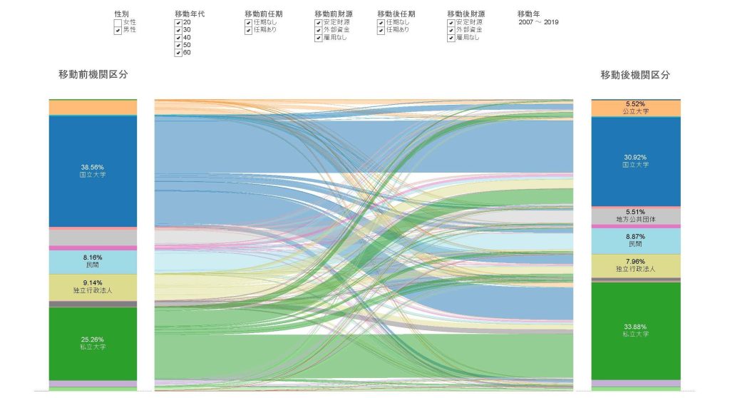
An example of a “visualization” of inter-institute mobility information that was extracted using the above method, while changing conditions such as gender, age when moving, tenure at post before and after moving, and available employment financial resources, is shown.
Figure 1 shows an overall picture of fluidity, Figure 2 visualizes mobility of male researchers, and Figure 3 visualizes mobility of female researchers. As understood from these examples, the visualization offers an intuitive bird’s-eye view of the route by which segments (left and right) before and after moving are linked, as well as how many people (represented by thickness) are moving along each route. The numbers of people and other numerical information can be obtained by moving the mouse pointer on a mobility route.


- トップ
- Visualizing the research capacity of national universities and research and development institutions
- Analysis of researcher mobility